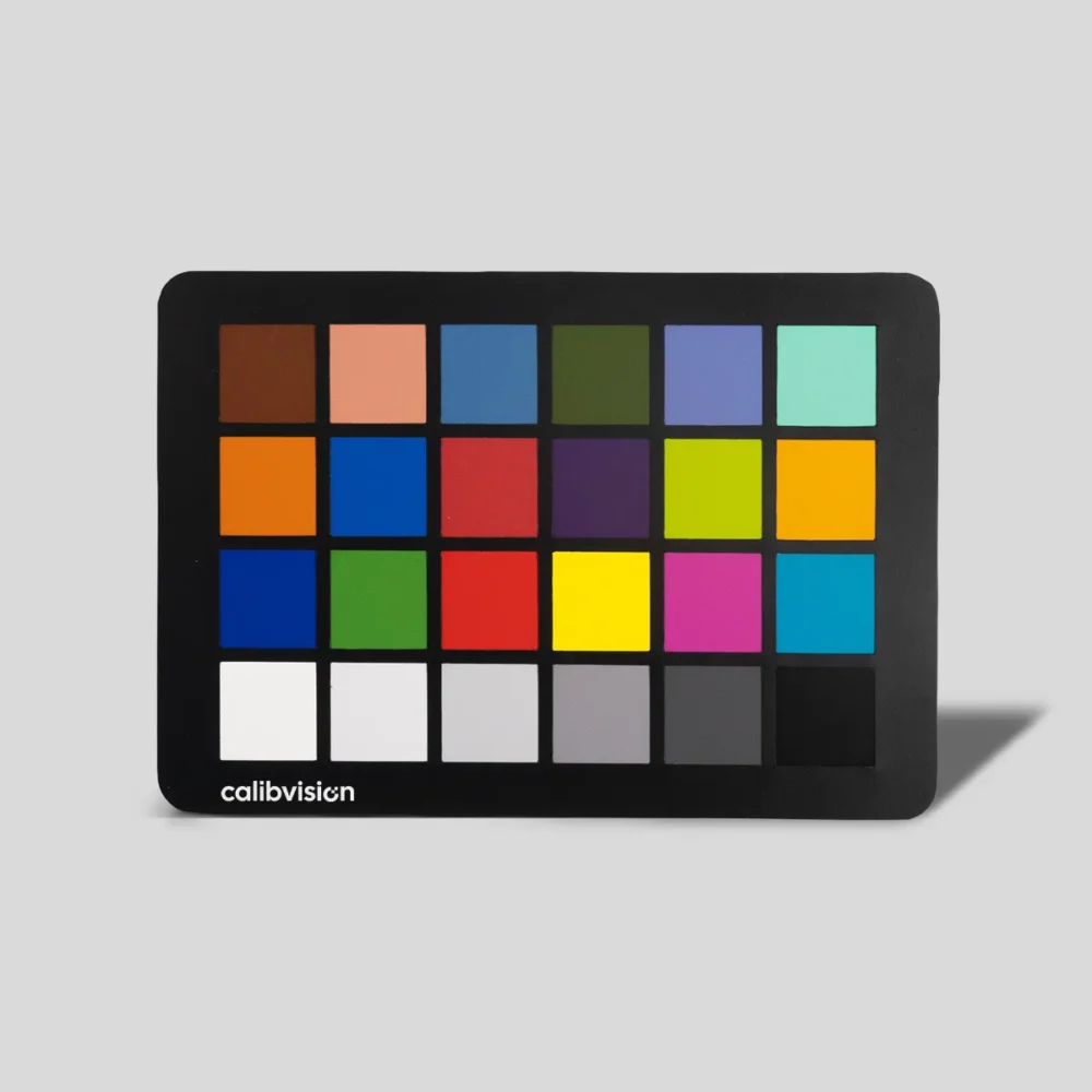
The 24 colors on a ColorChecker are arranged in a 4 × 6 grid, divided into 18 chromatic patches and 6 grayscale patches. The chromatic patches simulate naturally-occurring colors found in real scenes — skin tones, foliage, sky, common reds and yellows. The grayscale patches step from white (95% reflectance) down to black (about 3%) for white balance and tonal calibration.
Each patch has published reference values in three color spaces: sRGB (for digital display), **CIE L\*a\*b\*** (the international standard for color measurement), and Munsell (the traditional perceptual color notation system used in colorimetry research). The reference values below are CalibVision’s published data, measured under the international D50 / 2° standard illuminant on an X-Rite i1 Pro 2 spectrophotometer.
If you build calibration profiles, audit your camera’s color reproduction, or write color science software, this is the reference table you need.
How the 24 Patches Are Numbered and Arranged
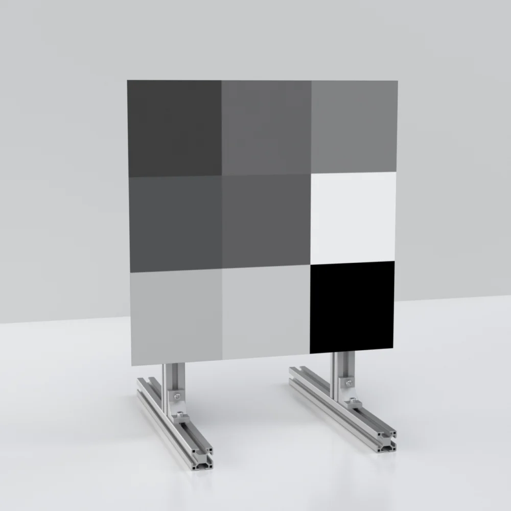
The chart is organized in 4 rows by 6 columns, read left-to-right and top-to-bottom. Patches are numbered 1 through 24, starting at the top-left corner.
You may also see patches identified by row letter and column number — A1 through F4, or A1 through D6 in some references — but the 1-24 numbering is the most universal. Both notation systems describe the same patches in the same positions.
The four rows have specific calibration purposes:
- Row 1 (patches 1-6) — Natural colors found in real scenes: skin tones, foliage, blue sky, foliage greens.
- Row 2 (patches 7-12) — Saturated mid-tone pigment colors: orange, blue, red, purple, lime, gold.
- Row 3 (patches 13-18) — Color space corner patches: pure blue, green, red, yellow, magenta, cyan.
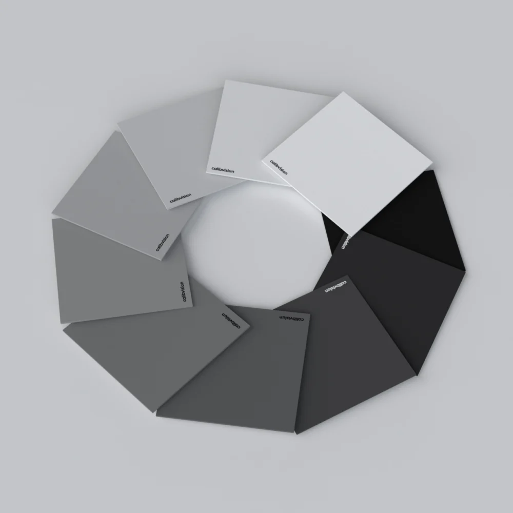
- Row 4 (patches 19-24) — Grayscale ramp from white (95%) to black (about 3%).
Together, these 24 patches give a profiling tool enough information to build a complete camera color profile. The 18 chromatic patches define the gamut transformation; the 6 grayscale patches set white balance and verify exposure linearity.
Complete Reference Values for All 24 Patches
All values measured on an X-Rite i1 Pro 2 spectrophotometer under the D50 / 2° standard illuminant. sRGB values are calculated for display in standard digital color workflows. Munsell notation reads as Hue Value/Chroma — for example, “5 YR 6/11” means hue 5 in the Yellow-Red family at Value 6, Chroma 11.
Row 1 — Natural Color Patches (Patches 1-6)
| # | Color Name | R | G | B | L\* | a\* | b\* | Munsell (H V/C) |
| 1 | Dark skin | 117 | 77 | 70 | 37.039 | 13.708 | 14.302 | 3.2 YR 3.7 / 3.4 |
| 2 | Light skin | 197 | 146 | 135 | 65.75 | 13.644 | 17.65 | 2.1 YR 6.5 / 4.3 |
| 3 | Sky blue | 92 | 123 | 163 | 51.195 | -3.408 | -20.681 | 4.5 PB 4.9 / 5.5 |
| 4 | Foliage green | 95 | 103 | 70 | 42.381 | -12.42 | 21.218 | 6.6 GY 4.2 / 4.1 |
| 5 | Light purple | 127 | 132 | 185 | 57.312 | 7.054 | -23.679 | 9.8 PB 5.5 / 6.7 |
| 6 | Bluish green | 112 | 187 | 175 | 71.651 | -30.446 | 3.404 | 2.2 BG 7 / 5.9 |
Row 2 — Saturated Pigment Patches (Patches 7-12)
| # | Color Name | R | G | B | L\* | a\* | b\* | Munsell (H V/C) |
| 7 | Orange | 220 | 113 | 55 | 59.665 | 33.518 | 53.797 | 4.7 YR 6 / 10.9 |
| 8 | Purplish blue | 61 | 98 | 171 | 42.313 | 8.267 | -39.799 | 7.5 PB 3.9 / 10.5 |
| 9 | Soft red | 193 | 83 | 103 | 50.449 | 43.211 | 13.908 | 2.5 R 5 / 10.4 |
| 10 | Purple | 89 | 63 | 113 | 31.134 | 20.937 | -22.798 | 5.1 P 3 / 6.8 |
| 11 | Lemon yellow | 173 | 178 | 68 | 70.963 | -20.298 | 58.058 | 5.1 GY 7.1 / 9.1 |
| 12 | Orange yellow | 237 | 151 | 58 | 70.173 | 19.952 | 63.559 | 9.9 YR 7.1 / 10.4 |
Row 3 — Color Space Corner Patches (Patches 13-18)
| # | Color Name | R | G | B | L\* | a\* | b\* | Munsell (H V/C) |
| 13 | Blue | 19 | 74 | 158 | 32.521 | 14.642 | -47.818 | 7.4 PB 2.9 / 12.6 |
| 14 | Green | 90 | 142 | 74 | 54.739 | -35.014 | 34.854 | 0.2 G 5.4 / 8.8 |
| 15 | Red | 172 | 50 | 65 | 40.25 | 48.387 | 23.683 | 4.8 R 4 / 12.1 |
| 16 | Yellow | 247 | 188 | 38 | 80.07 | 3.891 | 79.867 | 5 Y 8.1 / 11.3 |
| 17 | Magenta | 181 | 88 | 155 | 51.182 | 43.28 | -15.866 | 2.7 RP 4.9 / 12 |
| 18 | Cyan | 0 | 161 | 180 | 53.34 | -30.054 | -22.496 | 4.8 B 5 / 8.1 |
Row 4 — Grayscale Patches (Patches 19-24, White to Black)
| # | Color Name | R | G | B | L\* | a\* | b\* | Munsell (H V/C) |
| 19 | White | 249 | 248 | 248 | 95.33 | -0.721 | 1.441 | N 9.5 / |
| 20 | Neutral 8 | 205 | 203 | 205 | 80.868 | 0.205 | 0.478 | N 8 / |
| 21 | Neutral 6.5 | 161 | 159 | 162 | 66.234 | 0.167 | 0.073 | N 6.5 / |
| 22 | Neutral 5 | 120 | 118 | 120 | 52.089 | 0.177 | 0.114 | N 5 / |
| 23 | Neutral 3.5 | 71 | 72 | 73 | 36.448 | -0.139 | -0.454 | N 3.5 / |
| 24 | Black | 52 | 52 | 52 | 20.461 | -0.079 | -0.973 | N 2 / |
Reading the table. The “N” prefix in the Munsell column means Neutral — no hue, only a value step. The empty Chroma slot for the gray patches reflects this (zero chroma means no color saturation). For the 18 chromatic patches, all three Munsell components (Hue, Value, Chroma) are populated.
Why Each Color Was Chosen — The Logic Behind the Patches
The 24 patches aren’t a random rainbow. Each was chosen for a specific calibration purpose, going back to the original Macbeth ColorChecker design from 1976.
Skin tone patches (Patches 1, 2) — the two most important patches for portrait, beauty, and editorial work. Dark skin (Patch 1) and light skin (Patch 2) cover the range of human complexions. If a camera renders these two accurately, it can render most skin tones in real scenes acceptably.
Natural environment patches (Patches 3, 4, 5, 6) — sky blue, foliage, light purple (representing flowers and natural lavender hues), and bluish green. These cover the most common backgrounds in landscape, lifestyle, travel, and editorial photography.
Saturated pigment patches (Patches 7-12) — orange, purplish blue, soft red, purple, lemon yellow, orange yellow. These represent the kinds of mid-saturation pigments commonly seen in product photography, fashion, packaging, painted objects, and printed graphics.
Color space corner patches (Patches 13-18) — pure blue, green, red, yellow, magenta, cyan. These sit at the extremes of common digital color spaces. They stress-test how well a camera reproduces highly-saturated colors, and they reveal where a camera’s gamut clips.
Grayscale ramp (Patches 19-24) — white, neutral 8, neutral 6.5, neutral 5, neutral 3.5, black. These verify exposure linearity, set white balance, and confirm that the camera’s tone curve matches a known reference. Patch 22 (Neutral 5) at L\* 52.089 is the standard middle-gray reference that almost all white-balance droppers in profile editors use.
How These Reference Values Are Used in Practice
The reference values above serve four main purposes in real workflows:
1. Building camera profiles. Adobe DNG Profile Editor, DaVinci Resolve Color Match, Capture One Color Editor, and Lumariver Profile Designer all read these reference values internally. When you point any of these tools at a photo of a ColorChecker, the software compares your camera’s rendered values to these references, then builds a correction profile.
2. Verifying camera color accuracy. Camera reviewers and engineers use the difference between published references and a camera’s actual output (called ΔE — delta E — the perceptual color difference) to score how accurately a camera reproduces color. A camera with average ΔE under 3 is generally considered colorimetrically accurate; under 1.5 is exceptional.
3. Setting white balance. Patch 22 (Neutral 5) is the canonical middle-gray. Click the white-balance eyedropper on this patch in your profile editor and the software pulls white balance from a known-neutral reference.
4. Verifying exposure. Patch 19 (White) should land near 95% on a histogram or 90 IRE on a video waveform when correctly exposed. Patch 24 (Black) should sit around 4-5% / 5 IRE. If either is clipped, your exposure is out of range and your color profile will be wrong even if the chart detection succeeds.
Understanding the Munsell Notation
The original 1976 Macbeth ColorChecker was specified using the Munsell color notation system, which expresses colors in three perceptual dimensions: Hue (H), Value (V), and Chroma (C).
While most modern workflows use CIE L\*a\*b\* or sRGB, Munsell references are still cited in academic papers, photographic restoration work, art conservation, and fine-art reproduction. They’re worth knowing if your work crosses into those fields.
How to read a Munsell value like 5 YR 6 / 11 (Patch 7, Orange):
- 5 YR — Hue 5 in the Yellow-Red family. Munsell organizes hue around 10 hue families (R, YR, Y, GY, G, BG, B, PB, P, RP), each subdivided into 10 steps.
- 6 — Value of 6 on a 0-10 scale, where 0 is pure black and 10 is pure white. Value 6 is medium-light.
- 11 — Chroma of 11. Higher numbers mean more saturated. The maximum varies by hue and value; some hues can reach Chroma 16+, others top out around 8.
For neutral gray patches, Hue and Chroma are absent (only the Value matters), so the notation reads “N 5 /” for neutral at Value 5.
A Note on Reference Values vs. Your Specific Chart
The reference values in the table above are the published official references for what the 24 patches should be. The values your specific physical chart actually measures depend on:
- Manufacturing batch — even within the same brand, different production batches have small variation (typically under 1 ΔE)
- Pigment formulation — different brands aim for these references using slightly different pigment recipes
- Age and condition — older charts drift from references as pigments fade. See How Long Does a ColorChecker Last for the full story on aging behavior.
For commercial work where these tiny differences matter, individual measurement of your specific chart is recommended. CalibVision provides per-batch L\*a\*b\* and sRGB measurement reports as a paid optional add-on for any chart we ship, so you have your specific chart’s actual values rather than only the published reference.
FAQs
How many colors are on a ColorChecker?
24 patches total — 18 chromatic patches and 6 grayscale patches. The 18 chromatic patches simulate natural scene colors (skin, foliage, sky), saturated pigments, and pure color-space corners. The 6 grayscale patches step from white at 95% reflectance to black at about 3%.
What patches are in the bottom row of a ColorChecker?
Patches 19 through 24 — the grayscale ramp, going left-to-right from white through five steps of gray to black. They’re used for setting white balance, verifying exposure, and confirming the camera’s tone curve linearity.
Which patch is “middle gray” on a ColorChecker?
Patch 22 (Neutral 5) at L\* = 52.089 is the standard middle gray. This is the patch used by white-balance droppers in DNG Profile Editor, Lightroom, Capture One, DaVinci Resolve, and most other color tools. Clicking on it with the eyedropper sets the camera’s white balance to a neutral reference.
Why isn’t the white patch pure white (255, 255, 255)?
A “pure white” pigment that reflects 100% of incoming light doesn’t exist physically — the closest practical reflectance is around 95-98%. Patch 19 reflects approximately 95%, which corresponds to sRGB values around (249, 248, 248) — slightly off pure white but matched to what a real reflective material can achieve.
Are the colors on a ColorChecker the same in all brands?
Yes, the 24-patch layout follows an open international standard. CalibVision, Calibrite, X-Rite, and Datacolor all aim for the same published references. What varies between brands is pigment stability over time, per-batch quality control documentation, and size availability.
Can I use these reference values in my own software?
Yes. The 24-patch reference values are public-domain colorimetric data. You can use them in custom calibration scripts, scientific imaging software, or any color-management pipeline you build. If you’re publishing academic work, citing the original Macbeth 1976 specification or BabelColor’s measurement databases is the standard reference practice.
What’s the ΔE between a well-calibrated camera and these references?
A well-calibrated DSLR or mirrorless camera typically achieves 1-3 average ΔE on the ColorChecker patches when shooting in RAW with a custom profile applied. Out of the box, without a custom profile, most cameras land in the 4-6 ΔE range — visibly off but acceptable for casual work. After custom profiling with a fresh ColorChecker, the same camera can hit 1.5-2 ΔE consistently.
Where do these reference values come from?
The original specification was published by Macbeth Color & Photometry in 1976. The values have been re-measured and refined multiple times since — most notably by BabelColor (the academic reference database) and by major manufacturers using modern spectrophotometry. The values in this article are CalibVision’s published references, measured on an X-Rite i1 Pro 2 spectrophotometer under D50 / 2° illumination, the international standard for colorimetric reference measurement.
Get a ColorChecker 24 from CalibVision
We manufacture the 24-patch ColorChecker in 9 standard sizes from 25 × 40 mm (Nano) to 1600 × 2844 mm (8X), plus full custom sizes on request. Every chart is QC-measured against the published reference values shown in this article before it ships.
For commercial, scientific, and machine vision workflows where individual chart measurement is required as part of a deliverable, we offer optional per-batch L\*a\*b\* and sRGB measurement reports generated on an X-Rite i1 Pro 2 at D50 / 2°, plus bilingual (English / Chinese) traceability certificates suitable for ISO audits and peer-reviewed publications.
Color Checker 24 for True Color Reproduction & Camera Calibration
- 24 calibrated color patches for reliable color reproduction
- Ensures accurate white balance and consistent color results
- Designed to simulate real-world objects (skin, plants, sky)
- Uniform spectral reflectance for repeatable measurement
- Suitable for camera calibration, ISP tuning & imaging QA
- Works across photography, machine vision & color workflows
What to Read Next
- ColorChecker 24: The Complete Guide for Photographers, Filmmakers and Vision Engineers — the main reference covering what the 24 patches are and how they work.
- How to Use a ColorChecker 24 in Lightroom (Step-by-Step) — the Lightroom calibration workflow using the reference values above.
- How to Use a ColorChecker 24 in DaVinci Resolve (Step-by-Step) — the equivalent video workflow.
- How Long Does a ColorChecker Last? When to Replace Yours — what happens to these reference values as your chart ages, and how to test for drift.