You can buy a $20,000 cinema lens and a $50 chart you printed at home, and what you are actually measuring is the chart.
That sounds like a sales line. It is not — it is what the math says. The ISO 12233 standard makes specific demands on feature accuracy, contrast, flatness and spectral neutrality, and a desktop printer cannot meet any of them. The result is an SFR curve that looks plausible — the shape is right, the numbers are repeatable, no error messages, no warnings — and is wrong by anywhere from 10% to 50% depending on what you measured.
This post is the long version of the conversation we have every week with engineers who tested with a printed chart, got results that did not match the datasheet, and assumed the lens or sensor was at fault. By the end you will know exactly how a printed chart lies, how much it lies by, when (rarely) printing is OK anyway, and how to tell when you have crossed the line into needing a real chart.
If you want the broader picture of how ISO 12233 measurement actually works, the Complete Guide to ISO 12233 is the parent piece. This one is about the specific failure mode of self-printed charts.
Can I print my own ISO 12233 chart?
You can — the PDFs are free and the printer is cheap — but the chart you get back will not meet ISO 12233 specifications for feature accuracy, contrast or spectral neutrality. For QC, R&D or any measurement you intend to publish or audit, a printed chart will inject 10–50% SFR error and quietly invalidate the result. For casual checks and teaching, it is fine.
That is the executive summary. The rest of this post is why, with numbers.
What ISO 12233 actually demands of the chart
The standard does not say “print something with edges on it.” It specifies, among other things:
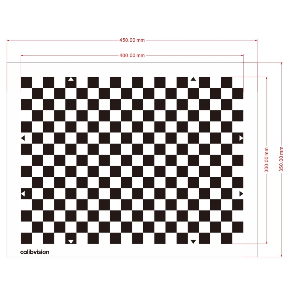
- Feature position accuracy sufficient to support spatial frequencies up to 4000 LW/PH on Enhanced charts — in practical terms, sub-millimeter line accuracy and tens-of-microns repeatability.
- Low, known contrast on the slanted edge — a 4:1 contrast ratio for modern eSFR charts, chosen specifically so the camera does not clip the signal.
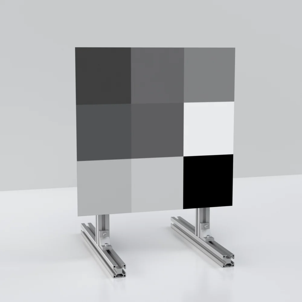
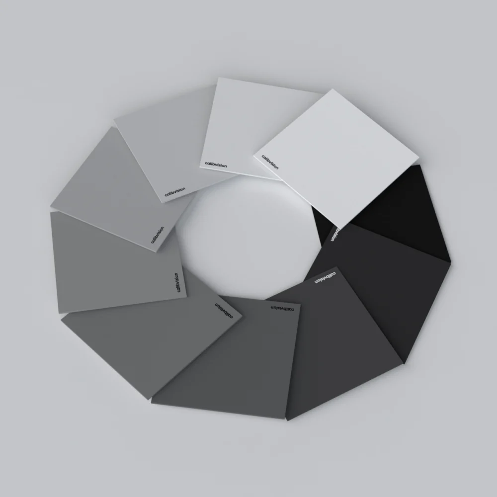
- Spectrally neutral grayscale, so the OECF patches behave the same way under any light source the standard allows.
- Flatness of the chart plane — bending or warping introduces simultaneous perspective and focus errors across the edge.
- Uniform surface reflectance or transmittance, so the response across the chart is not modulated by paper texture or coating non-uniformity.
The reason these requirements exist is that the slanted-edge algorithm extracts sub-pixel information by oversampling. It assumes every pixel in the edge region of interest reports a true reflectance value of the chart at a sub-pixel position. If the chart’s own geometry, contrast or reflectance is wrong by amounts comparable to a pixel transition, that wrongness goes straight into the SFR curve.
A consumer printer misses every one of these requirements at once.
The 5 ways a printed ISO 12233 chart lies to you
These are not theoretical issues. Each one is a measurable, repeatable corruption of the SFR curve.
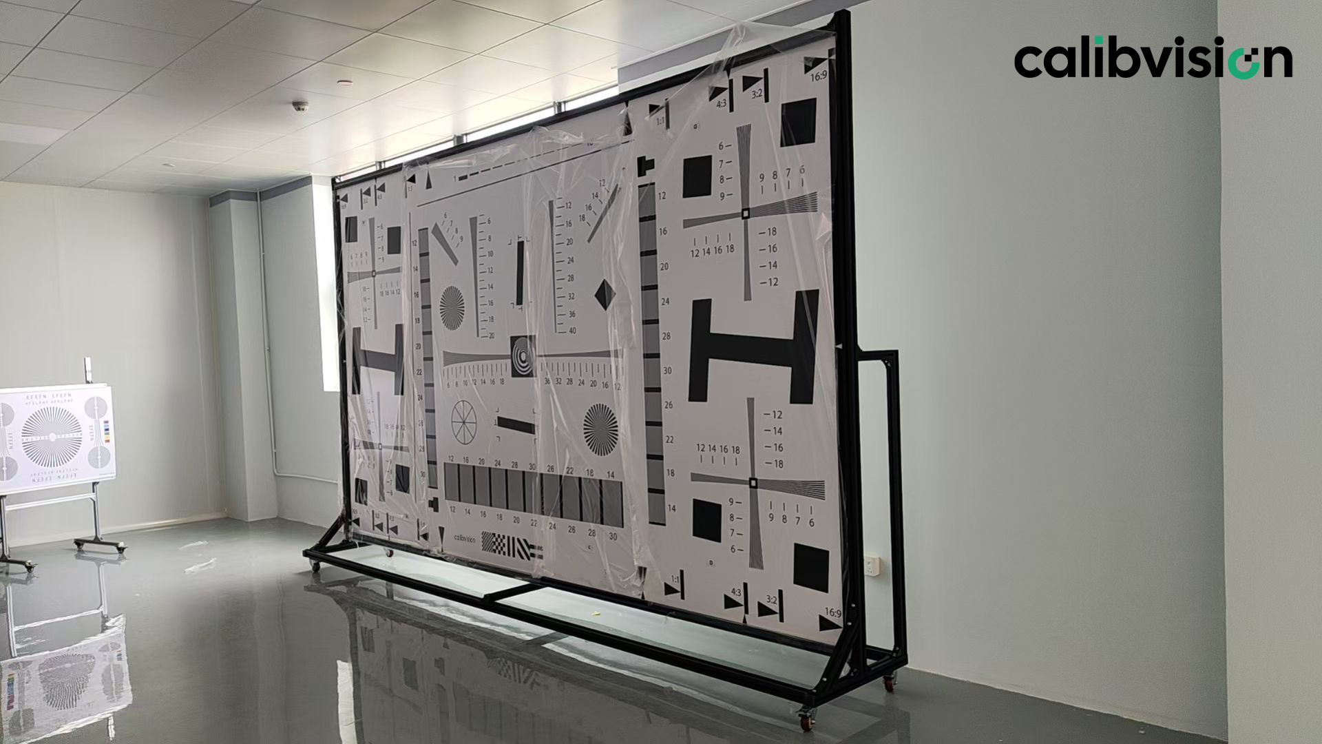
1. Feature position error: ±0.5–2 mm vs ±15 µm spec
A laser-drawn film chart holds ±15 µm feature position accuracy across the full pattern. A consumer inkjet, even a good one, lands roughly between ±300 µm and ±2 mm, depending on paper, humidity and how many millimeters from the printhead’s home position the feature lives. That is 20× to 130× looser than the chart it is trying to imitate.
The math of why this matters: the slanted-edge algorithm needs to know where the ideal edge is in order to measure how the camera spreads it. If the ideal edge is itself in the wrong place by half a pixel-width, the algorithm reports that as part of the camera’s blur. At 1000 LW/PH, half a pixel-width on a typical chart corresponds to roughly 100–200 µm. You are well into “the chart is the dominant error source” territory before you even start measuring.
2. Ink bleed kills the slanted edge
The whole reason ISO 12233:2014 moved to a low-contrast 4:1 slanted edge is that the camera’s response to a sharp edge transition is what the algorithm needs to recover. Sharp meaning: in the physical chart, the transition from black to white happens over a distance much smaller than one pixel on the captured image.
An inkjet droplet on plain paper spreads out (the “dot gain” effect) over 80–150 µm before drying. Office laser printers do better — toner particles are smaller — but still produce a fuzzy ~30–60 µm transition zone on uncoated paper. Either way, the chart’s edge is no longer sharp; it has its own built-in blur, which the algorithm cannot distinguish from camera blur and obediently rolls into the SFR result.
Visually: your slanted edge looks fine to the eye. Under a microscope it looks like a watercolor.
3. Paper warp = focus error + perspective error, simultaneously
Plain printer paper absorbs ambient humidity and warps measurably within hours of leaving the printer. A 2 mm bow at the centre of an A3 chart sounds trivial. It is not. It produces two errors at once:
- Focus error: parts of the chart are physically closer or further from the lens than the focus plane, so the SFR you measure at those regions includes a defocus blur that is not the lens’s fault.
- Perspective error: the slanted edge is no longer at the angle the algorithm assumes, which biases the oversampling reconstruction.
Mounted on stiff foam-core or aluminum composite this is better but never as flat as a film chart on a backlit box or paper on a calibrated reflective frame. We see this failure mode more often than any other — engineers blaming a lens for soft corners that are really just chart bow.
4. Contrast and density fall short of the standard
ISO 12233 eSFR charts are produced to a defined contrast (typically 4:1 for modern low-contrast targets) with an optical density that holds across the surface within tight tolerances. A photolithographic film chart routinely hits OD > 3.0; a high-quality print on photographic paper can approach this; a desktop inkjet on plain paper produces an OD between roughly 1.0 and 1.8, with significant variation across the same sheet.
What that means for the measurement: the true contrast of the chart you used is not 4:1, it is whatever your printer happened to produce that day. Every SFR analysis tool assumes the chart contrast is at the spec value; if it is not, the absolute SFR values on your curve are scaled wrong. Different sheets from the same printer scaled differently. Comparing curves taken on different days is now meaningless.
5. OECF patches can’t be trusted (spectrally non-neutral inks)
Modern ISO 12233 charts include grayscale patches (OECF patches) used to linearise the camera response before the SFR algorithm runs. The standard requires those patches to be spectrally neutral — the same reflectance at every wavelength the camera sees.
A four-color (CMYK) consumer printer mixes inks to produce gray. That gray is visually neutral under one light source and noticeably warm, cool or magenta under another. The OECF curve you derive from that chart will only be right under the exact light source you calibrated under, and any spectral mismatch propagates into the SFR result via the linearisation step.
Photolithographic chrome and laser-drawn silver-bromide film, by contrast, are spectrally neutral by physics — the gray patches are gray under any illuminant.
What your SFR curve actually shows with a printed chart
Put concretely, here is the pattern we see when customers send us “before and after” data from the same lens, first measured on a home-printed chart and then on a calibrated film chart:
| Measurement | Home-printed chart | Calibrated film chart |
|---|---|---|
| MTF50 (cycles/pixel) | reads 15–25% low | true value |
| Limiting resolution (SFR10) | reads 20–40% low | true value |
| Edge sharpness across field | corners look much worse | corners are actually fine |
| Repeatability across sheets | ±10–15% sheet-to-sheet | <1% chart-to-chart |
| Repeatability across days | ±5–10% (humidity-driven) | stable for years |
The shape of the curve is roughly right. The peak frequency is shifted, the tail is too steep, and the absolute values are wrong — but it looks like an SFR curve. That is what makes printed charts so dangerous: they do not produce obvious garbage, they produce confident-looking garbage.
Two operational consequences worth pulling out of that table:
- You will misdiagnose lens problems that do not exist. A printed chart pushes corner MTF down, so a lens with perfectly acceptable corner performance reads as a soft-cornered lens. You spend a week chasing a fix for an artifact of the chart.
- You will pass parts that should fail. Because MTF50 reads low by a roughly constant factor, a sample that drifts toward your reject limit on a printed chart was already past it long before you noticed.
When a printed chart is OK (rarely)
We are not going to pretend printed charts are never useful. They are — for a narrow set of cases:
- Teaching and classroom demos. You want students to see what the slanted-edge algorithm does; absolute accuracy is irrelevant.
- “Does the camera turn on” smoke tests. You’re verifying that the optical path is roughly functional, not putting a number on it.
- Early prototype debugging where you care about direction of change (got better / got worse) and you measure on the same sheet, same lighting, same day, same camera. The chart errors at least cancel.
- Software development on the SFR pipeline itself, where you want a varied input to test the analysis code.
Even in those cases, treat the numbers as relative. The moment your conclusion has a customer-facing consequence — a published spec, a passed/failed module, a supplier dispute, an audit — you need a chart you can defend.
A useful rule of thumb: if you cannot put the chart on a quality record, you cannot put the result on one either. A printed chart cannot carry a serial number, a measurement report or a traceable certificate. Anything downstream of it inherits the same lack of traceability.
🔗 Related cluster post: [6 Common Mistakes That Ruin Your ISO 12233 Test Results →]
What “professional” actually means
The word “professional” gets diluted to mean “expensive.” For an ISO 12233 chart it means something specific:
- Production process tighter than the measurement. Photolithography on glass for sub-µm features, laser-drawn silver-bromide on film for ±15 µm features, UV-printed on rigid ACM for matte reflective charts. None of these are processes you have in your office.
- Verified per unit, not per design. Every chart inspected and measured, not “the design conforms, ship it.” The inspection record ships with the chart.
- Traceable. Calibration to a recognised national metrology institute (NIST, NIM, PTB) through an accredited lab. Without traceability, “accurate” is a marketing word.
- Spectrally and dimensionally stable across years. Film and quality paper charts hold their values for 3–5 years under normal lab conditions; printed-at-home paper drifts within days.
Calibvision’s ISO 12233 charts are laser-drawn on transmissive film at ±15 µm feature accuracy, or printed on matte photographic paper at ±0.1 mm for the largest sizes. Each unit ships with a serial-numbered dimensional inspection report, and third-party CNAS-accredited (CNAS L0579) calibration is available on request — CNAS is an ILAC-MRA signatory, so the certificate is recognised internationally.
That is the gap: roughly a 30× to 130× improvement in feature accuracy, plus stable contrast, plus spectral neutrality, plus a piece of paperwork your customer’s auditor will accept.
🔗 Background: §7 of the Complete Guide — Film vs Photographic Paper →
The cost of being wrong
People print their own chart to save $200–$500. Here is what that decision usually costs once errors are accounted for:
- One round of re-testing after a customer disputes your numbers: half a day of engineering time at fully-loaded rates already exceeds the chart price.
- One misdiagnosed lens or module: days of rework, possibly a returned shipment, possibly a damaged relationship with a supplier.
- One failed audit: “we tested it” without a traceable record is worse than not having tested it. Customers in automotive, medical and aerospace will treat untraceable measurement as no measurement.
- All historical data invalidated: if the printed chart drifted day to day, you cannot compare a measurement from January to one from July. Your trend data is noise.
The honest framing: a calibrated ISO 12233 chart is not an expense, it is the floor of your measurement uncertainty budget. If you are willing to accept ±25% uncertainty on every SFR number you report, print away. If you are not, the chart cost is the cheapest line in the budget.
Frequently asked questions
Where can I download a free ISO 12233 chart PDF? Several test pattern PDFs are available from imaging-software vendors, academic sites, and the ISO 12233 documentation page. They are intended as design references and for printer/display testing, not as measurement-grade charts. Printing one on a desktop printer produces a visual representation of the design at roughly ±0.5–2 mm feature accuracy — usable for demonstration, not for ISO 12233-compliant SFR measurement.
Can I get usable results from a chart printed by a professional photo lab? Better, but still not lab-grade. Professional photo printing on glossy paper can achieve roughly ±0.1–0.3 mm accuracy and good contrast, which is acceptable for casual checks and rough lens comparisons. It still falls short of the ±15 µm a laser-drawn film chart holds, so SFR at high frequencies (above ~1500 LW/PH) remains unreliable, and there is no traceability.
Does paper choice matter on a printed chart? Yes, but it does not fix the underlying problems. Coated photo paper reduces ink bleed and dimensional drift compared to plain paper, and matte finishes reduce specular reflections. Even so, dot gain, contrast variability and lack of traceability remain — you have moved from “very bad” to “less bad,” not to “good.”
What about printing on aluminum composite (ACM)? A direct-to-substrate UV print on ACM, done by a specialist, is genuinely useful for large reflective charts where film is impractical. This is the process used for many commercial large-format charts. It is not what people mean when they say “I printed my own” — and the typical feature accuracy of professional UV print on ACM (around ±50 µm or worse) is still much looser than laser-drawn film.
My printed chart gives reproducible numbers — doesn’t that mean it works? Reproducible and accurate are different things. Printed charts often give reproducibly wrong numbers — repeated readings on the same chart, same day, same camera will be tight, because most of the chart’s errors are static. The moment you change sheet, day, humidity, or printer, the numbers drift. Reproducibility within a session is not the same as measurement validity.
How can I tell if my current SFR results were biased by a printed chart? Three signs: corner sharpness looks dramatically worse than centre on a lens whose datasheet says it is uniform; MTF50 measurements drift more than ~5% between sessions; the chart shows visible bowing, ink coverage variation, or paper texture under raking light. Re-measure with a calibrated film or paper chart and compare — if the numbers move significantly, the chart was the dominant error.
What is the minimum a chart needs to be considered “real” for ISO 12233? Three things, in priority: feature position accuracy at least 5× tighter than the smallest spatial detail you intend to measure (typically ≤±50 µm for 4000 LW/PH work); a known, stable contrast on the slanted edges; and a measurement record per unit. Without all three, the result is a visual demonstration of SFR, not a measurement of it.
Stop testing your printer instead of your lens.
Calibvision ISO 12233 resolution & SFR test charts are laser-drawn on transmissive film at ±15 µm feature accuracy, or printed on matte photographic paper at ±0.1 mm — in 17 sizes from 50×89 mm to 1600×2844 mm, in Standard and Enhanced (Pro) versions. Each chart ships with a serial-numbered inspection report; third-party CNAS-accredited calibration available on request.
→ See the ISO 12233 chart range and find your size
For the broader picture on how ISO 12233 measurement actually works, read the Complete Guide to ISO 12233 Test Charts.